“Nobody ever got it right”: HBO Got 1 Thing Wrong About the Iron Throne That Originally Sent George R. R. Martin on a Wild Goose Chase
- George R. R. Martin's quest for the perfect Iron Throne turned deeply personal.
- Martin's detailed Iron Throne description proved challenging for visual artists.
- That's the reason HBO's Iron Throne portrayal didn't match the creator's vision.
In George R.R. Martin’s A Song of Ice and Fire series, those who have survived the harsh lands of Westeros see the Iron Throne as the ultimate symbol of power. Yet, for the creator of the Game of Thrones, the Iron Throne has been a constant source of frustration.
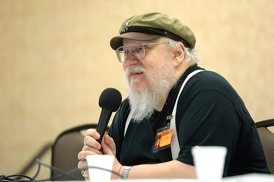
It is because in HBO’s adaptation of Game of Thrones, the studio designed the Iron Throne differently than the creator’s described in his books. This changed how it looked from his original idea.
George R. R. Martin’s Gritty Description of the Iron Throne Differs From its Portrayal on TV
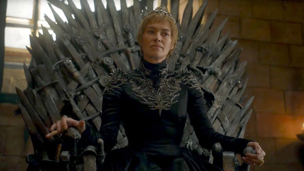
George R. R. Martin carefully described the Iron Throne in his books. It’s a massive chair made from a thousand swords taken from Aegon the Conqueror’s beaten foes. The throne is described uneven, towering over the room, and uncomfortable to sit upon.
The swords are not neatly placed but randomly stuck together, which shows the violent history of Westeros. However, turning this detailed description into a visual image has been difficult. The author said in an interview with Laura Miller on 92NY Plus:
But nobody ever got it right. I mean there were a comic book version and there were versions in the card game and the board game and there were versions on the cover and there were versions that were done for conventions.
Early illustrations for the books and versions like the popular card game often showed a more even and good-looking throne. These images, though nice to look at, didn’t match the rough and harsh throne Martin had imagined.
George R. R. Martin’s Efforts Towards the Perfect Throne
George R. R. Martin’s search for the perfect Iron Throne became personal. He even tried sitting on a wooden version at a book event in 1996, but it didn’t feel right. Eventually, he teamed up with French artist Marc Simonetti. After many talks and changes, they created a design that truly captured the throne—a huge, intimidating seat made from the swords of war. He said in the same interview:
You know the very first there was a wooden one that I sat on in 1996 at the ABA that look like the version on the first edition the silver book. But none of them were ever really right.
The 75-yar-old doesn’t criticize how HBO showed the Iron Throne, though. The show’s throne, though simpler than in the books, works well for TV. Making the huge, detailed throne from the books would be too costly and impractical for filming. Martin added:
Now, of course you can’t do in the TV show, it’s not something I criticize HBO for something like that. I mean the thrones they have are enormously large and cumbersome to move and expensive to build this monstrosity would blow the budget of an entire episode.
The Iron Throne’s journey from idea to different pictures shows how hard it is to turn books into visuals.
Watch Game of Thrones on HBO Max!


