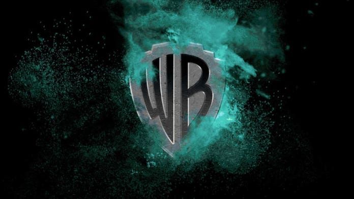
Warner Bros. Gets A New Logo
Popular entertainment company, Warner Bros. revealed a new, revamped logo. The new logo is intended to modernize its identity. Also, Warner Bros. also hopes that the new logo will bring the studio more to the likability of the 21st century. Pentagram, world’s largest design consultancy is behind the new logo. Warner Bros. is set to celebrate its hundredth anniversary in less than five years.
No Big Change

The new logo revealed is not much different from the already existing one. However, the new Warner Bros. logo is more streamlined. Also, it is much more simpler to match the trend of simplicity of the current age. Pentagram created the new logo sans the shield typeface. The design company focused on two core objectives for the new logo. Firstly, the logo was to represent the brand’s move towards future. And secondly, to convey Warner Bros.’ strong belief in the power of story.
The New Face

The iconic water tower of Warner Bros. also got a new face. WB chair and CEO, Ann Sarnoff revealed the new logo and the tower. Sarnoff was spotted wearing a bugs bunny tuxedo during the event. The logo is still recognizable to the fans. However, it is more sleek and thinner than the older version. The pentagram wanted the logo to be “contemporary, while also being able to be used as a sponge for any story they wanted to tell,” says the Pentagram partner Emily Oberman. The iconic Water Tank of WB will be fully repainted in the coming months.
A New Mission Statement

Warner Bros. also came up with a new mission statement for the company. It now reads, “To be the world’s leading creator and distributor of extraordinary entertainment by partnering with the world’s most inspiring storytellers.”
WB is the behind several movies, shows and cartoons. Some of them are the Harry Potter series, the famous T.V. show Friends and the latest box office success Joker.
Sources: Comicbook, Fast Company


