Twitter User Trolls “Wonder Woman 1984” Poster, Fans Give Him The Ultimate Clapback
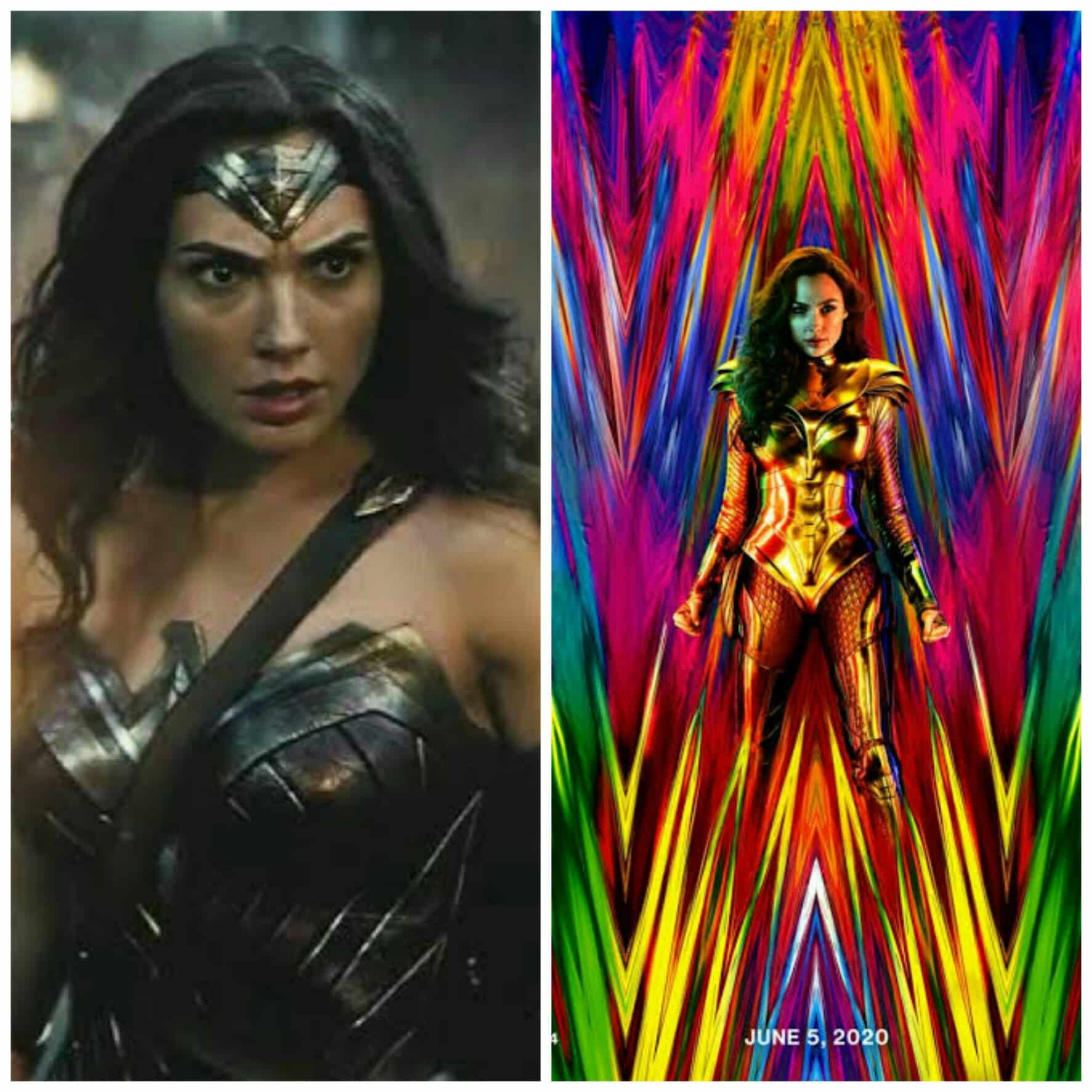
Patty Jenkins dropped the teaser poster for Wonder Woman 1984 last week and it gave the world a new neon-hued look at Wonder Woman’s next adventure. While the poster was met with an overall surprised and positive response, there were still some naysayers who were comparing the colour scheme to Thor: Ragnarok, as if Marvel invented that colour scheme. But going one step above, there was a comment by a twitter user who shared another less-than-postive comment about the poster but Wonder Woman 1984 fans certainly weren’t afraid to clap back at the misguided take about the poster.
The Wonder Woman 1984 Poster Criticizing Tweet And The Burning Replies
The tweet, which you can check out below sees the person asking who the target audience of the poster (and movie) is while arguing that the “mystique” of the Wonder Woman we saw in Batman v Superman: Dawn of Justice has been replaced by “Sephora sh*t“.

In the days since that tweet was first shared, a slew of people have shared their defense of the Wonder Woman 1984 poster, and of the oh-so-casual misogyny that the tweet seems to have. Some have reiterated the fact that Wonder Woman 1984 is in fact a prequel set in 1980s while others have defended the vivid colours and new look of Wonder Woman in the poster. Here we have compiled some of our favourite responses:
Also Read: Ivan Reitman Says That “Ghostbusters 3” Will Be ‘Extraordinary’!
Ah yes, this new poster is clearly geared towards JUST women because it has… *checks notes*…. colours in it
— 🖤🩶🤍💜Cassie, ace disaster extraordinaire (@d20love) June 6, 2019
Straight men: WONDER WOMAN'S TARGET AUDIENCE IS MEN
Everyone else: No it isn't pic.twitter.com/DZU1LZDNL0— Rachel Leishman (@RachelLeishman) June 6, 2019
"who is the target audience??"is such a hilariously straight white dude way to say "wait am *I* not the target audience???" pic.twitter.com/StQqwXtvHq
— Anthony Oliveira (@meakoopa) June 6, 2019
"who is the target audience??"is such a hilariously straight white dude way to say "wait am *I* not the target audience???" pic.twitter.com/StQqwXtvHq
— Anthony Oliveira (@meakoopa) June 6, 2019
We think that the poster looks fine and some people are just too bothered by bright colours. May we suggest some sunglasses for them?
(Source: comicbook.com and economictimes.com)


